Successful garden design blends shapes, colours and materials without jarring the eye.
It’s the delicate art of fusing complementary elements to evoke a particular experience. Whether that’s an energetic rush or soothing ease – and everything in between.
1. The first cue should be taken from the architecture and location of the home.
Creating a seamless transition between your home’s interior and surrounding landscape is always a balancing act. It’s the connecting threads that you don’t always notice along with a thoughtful use of colour, that brings the complete picture together.
“I begin with open awareness and curiosity, taking note of the building style, location of the property and character of the home owner,” says Pepo Director and Designer, Nicola Cameron. “Transitioning between the spaces from inside to out should be effortless.”
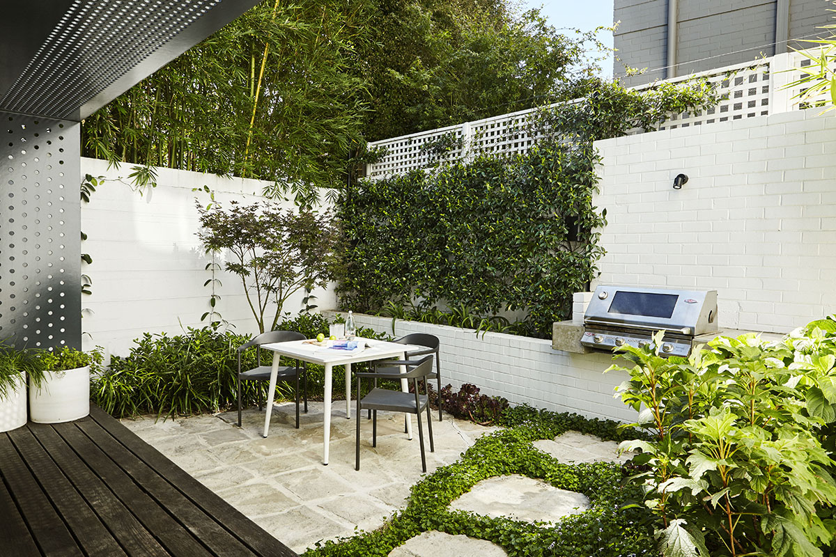
Natural pairings like sandstone and wood call for a particular approach, compared to a red brick retro home for example, which sits more happily amidst plants in strong green and primary colours. A house nestled in a dark valley with very little breeze enjoys a visual lift with the help of brighter colours and plants that reflect light.
By contrast, a timber and glass beach-side property on a wide hot road and perched on a hill, cries out for refreshing, cool surrounds that are calm and grounding.

The residents want to be welcomed by swathes of muted-coloured plants in greys and rich greens, such as those chosen in this Pepo designed garden courtyard in Bondi, (pictured above). (For more, visit North Bondi Courtyard)
2. Floor coverings, cushion colours, benchtops and furniture provide valuable colour clues.
Selecting the dominant interior colour will inform supplementary shades and establish a cohesive design. A stainless-steel kitchen bench top with chrome finishes sings when a clutch of sheeny, reflective plants sway in the breeze outside.
Equally, a piece of art in dominating hues will demand attention as you enter a room. It calls out for a brightly flowering tree for example, to support its visual positioning. Home owners and guests alike almost breathe a sigh of relief once the blossoms catch their eye and balance is achieved.
3. Paint choices are a crucial indicator.
The residents of this property in McMahon’s Point, (designed by Tribe Studio) chose a black and white theme which extended to the rear of their house.

The Pepo Botanic Design team selected the garden colours carefully to complement the architectural hues and tones of the internal furnishings.
A mix of green plants with white flowers (to link the crisp exterior paint colour) were chosen, including Ophiopogon jaburan, Hydrangea sp, and Gardenia augusta. Meanwhile, the black architectural detailing was anchored by darker foliage choices such as Acer palmatum ‘Bloodwood’, Aeonium ‘Schwarzkopf’ and Ajuga ‘Jungle Beauty’.
White pots were included and soft white sandstone chosen as the ground material which illuminates at night thanks to soft lighting. (For more, visit McMahons Point Garden).
4. The relationship between the different hues on the colour wheel determines the likelihood of cohesion.
Given the bright light of the Australian sun, it’s important to follow some clear rules. Separating your choices into “hot” and “cool” colours is the starting point. ‘Hot’ tones such as reds, oranges and yellows are adjacent on the colour wheel. Their shared yellow pigment, when planted together, creates a feeling of harmony.
Meanwhile, cool colours on the wheel share a blue pigment and evoke a calming synchronicity.
And while white is a perennial favourite it needs to be integrated mindfully. It is best used as a punctuation point to lighten up a dark corner, alongside silvery leaved foliage. “White isn’t a dominant colour in nature and it’s important to consider it carefully when using it as a design element,” says Nicola. “Often it’s best to combine white coloured plants in a garden with a cool pallet rather than hot.”
This contemporary renovation in Bellevue Hill, (illustrated in the diagram shown below), was designed to create an open, happy and colourful space. 
The garden had to accommodate three boisterous boys, two Mums and their dog Buddy. Lively colours such as pinks, oranges and greens were used to complement the family’s personalities as well as interior tonal choices. This was brought to life through a variety of plant choices, including those shown below.

It was important that the internal and external spaces visually and functionally flowed into one another. The design needed to be a flexible and uplifting space for family and friends.
5. Fashion and trends will always influence our colour choices.
Autumnal colours are currently trending. They are “being used to create cosy, joyful spaces that nurture and inspire,” according to the Dulux Season Trend forecast 2019. (For more, visit Dulux Colour Trends.)
Combinations such as natural deep greens mingle with authentic neutrals, copper hues and soft terracotta. It’s a palette which is natural and designed to restore. Soft internal furnishings in burgundy hues for example could be linked with a Japanese maple tree with its coppery hues. Equally, a spray of blue hydrangeas would blend beautifully with sage green interiors.
The level of saturation is also important and there are many variances in the brightness of colours. While the breadth of shades offers greater choice, it can also impact the success of a design. Even the slightest nuance in colour needs to be considered.
Our capacity for absorbing what surrounds us is often subtle. We don’t always realise that an easy transition between spaces, can be deeply restorative.
Removing visually jarring elements in our environment creates a sense of space and the role of colour will always have an important part to play.
Finally, when trying to determine the ‘go-to colour that never fails’ in the garden, the answer is straight forward. “Yellow, pinks and reds are popular favourites,” says Nicola. “But the colour green with all its tones and textures will always be a clear winner.”
Nicola Cameron is the Founder and Co-Director of Pepo Botanic Design in Sydney.